Most of us can name a few colors that we like, but when decorating at home, how does that translate into something that’s cohesive, and most importantly – suits you and your personal style.
Luckily for us, there are professionals out there who live and breathe interiors, color, and helping people find what’s right for them. I asked 13 interior décor experts and bloggers a simple question:
“What is your one piece of (uncommon/unique) advice for people in choosing a color scheme for their home?”
It’s the first time I’ve asked a question on the subject of color, so I was unsure of the of the responses I’d get. But I’ve been amazed by the quality – and creativity – of the responses I received from these 13 experts. And it's advice that can help you when choosing the right color for anything from Area Rugs to what color Wall Murals. I’ve listed all of them below.
MARIA KILLAM, COLOR ME HAPPY

Maria is the CEO and Founder of Understanding Undertones, and writer at Color Me Happy. A decorator, author, speaker and Certified True Color Expert, she is an internationally recognised authority on color. Her work has been featured in leading design publications like HGTV, Houzz and Home Beautiful. You can follow Maria on Facebook.
Most often when decorating, it’s necessary to work with some existing pieces and finishes in the room, so it’s important make the best of what you’ve got and build on it. Get to know the undertones of any neutral furnishings and finishes you’re working with so you flatter them and make them assets. Clashing neutral undertones is most often what makes a room feel a bit off or unsatisfying. Every space has neutrals, so establish your neutral palette based on what’s existing in the room and then you can have fun pulling in coordinating accent colours from all kinds of inspiration sources that bring your room to life.
KATIE HAGAR, BETTER LIVING THROUGH DESIGN
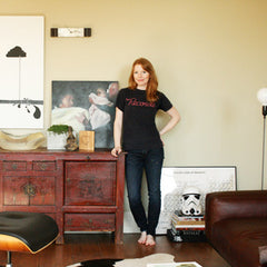
Katie Hagar is Editor in Chief of Better Living Through Design – a leading design guide for Home furnishings, design elements, gadgets & accessories. She has worked as a textile designer and an interior designer. You can follow Katie on Twitter.
If I could give one piece of advice, it would be to look at one's own closet for inspiration on a color scheme. That, or pick a favorite piece of artwork, and build a room around the less predominate colors.
JESSAMY TSORIS, COLOR ZEN

Jessamy owns Color Zen, a homegrown, interior design studio with paint color consulting roots. She designs inspired, contemporary spaces for clients sprinkled across the country and world, sharing blips on her website blog, instagram and design publications. Jessamy has a deep passion for feel good ambiance and all the different ways it can be created.
My best advice for choosing colors in the home... Let go of fear! and escape for a few hours of alone time to gather inspiration. This inspiration can be anything - thoughts, objects or imagery.
Ask yourself, "What really feels good to me?". Is it a coffee shop, a beach, a scarf, a photograph, warmth, light, nature, or your lifelong, favorite color? Everyone has a relationship with color to share.
Focus in on 3 colors from this reflection. The ones that feel absolutely comfortable, yet exciting. And just own it! They are uniquely you.
Figure out how to use these colors in a livable, balanced way. They should give you enough flexibility to shift accessories over the years. If you struggle with implementation, consider hiring a designer if even for a short session.
Color in the home is so very powerful. Give it the consideration it deserves and have fun in the process :)
HEIDI FERGUSON, HONEYBEAR LANE

Heidi Ferguson is the founder of Honeybear Lane - a blog about building, decorating, cooking, and crafting. She's on a journey to make her family's new construction cookie cutter house into a cozy farmhouse style home that perfectly reflects her style. You can find Heidi on Instagram.
I don't necessarily believe in firm color schemes, although I know a lot of people enjoy it. I always decorate in mostly neutrals with pops of color here and there, which I can switch out as I like. If you're going to have a color scheme, be sure that they are colors you love that have stood the test of time with you...colors that you have loved for years and years. I once went on a purple kick and did a bunch of purple decor and after about two months hated all of it. Also, certain colors can actually pass as neutrals, like many different shades of blue for example. They go well with so many different colors that they are easy to pair with almost anything.
CARMEL PHILLIPS, OUR FIFTH HOUSE

Carmel Phillips is the interiors blogger behind Our Fifth House, where she's had projects featured in publications like Family Circle, All You and Cottages & Bungalows Magazines, as well as her collaborations with leading brands. You can also find Carmel on Instagram.
My one piece of advice for choosing a color scheme for your home is to look to your closet. Your wardrobe is a great place to start looking for color inspiration. It's an indication of the colors you feel the most comfortable in and gravitate towards.
When finalizing a color scheme or selecting paint colors for your walls I think it's also helpful to think about how you want a room to feel rather than focusing on how you want it to look. Color, more so than any other element in a space, sets the mood. Considering whether you want the room to feel calm, cozy, happy or edgey will help you to not only choose a color scheme but also the level of saturation you want out of each hue.
KIRSTEN GROVE, SIMPLY GROVE
Interior Stylist and author, Kirsten Grove, has always had a passion for interior design. She started Simply Grove in 2008 as a way to show off eye-catching design and decor from all over the world. And it's become a hang-out for like-minded creatives with a love of interiors and an appetite for design eye-candy. Kirsten has styled and designed for clients all over the world. You can also find Kirsten on Instagram.
Picking a color scheme for your home is a big deal! I have a couple of key tips for choosing the right colors for your home. Evaluate the amount of light you have in your home, this will matter when picking out your wall color. Light and airy is always a good way to go! Start out minimal, don’t pick 5 colors hoping they’re going to all work, start off with 2-3 colors. Think wall color, furniture color, and one accent color.
Finding a color scheme is a process especially if you aren’t buying everything together, so build your colors as you go. If you’re totally lost, try starting off with a monochrome theme and add in one or two accent colors. Also, don’t be afraid to try different schemes in different rooms but try sticking to complimentary colors and furniture to make everything still flow nicely throughout your home.
SARAH FOGLE, UGLY DUCKLING HOUSE

Sarah Fogle is the voice behind the Ugly Duckling House - a blog about interiors DIY and decorating. She writes about her adventures (and misadventures) whilst DIY-ing and decorating a number of homes. When she's not building something, you can find Sarah on Instagram.
I would suggest looking to your everyday wardrobe. Often, the colors in your closet that are your favorite pieces will contain your favorite hues and patterns. The ones you gravitate toward most are a pretty solid indicator of what colors (and patterns) you'll enjoy most when you use them in your decor... and prevent you from getting too influenced by color trends that aren't your style.
ANNA DORFMAN, DOOR SIXTEEN

Anna Dorfman is an art director, illustrator and artist, who also writes for her blog, Door Sixteen. She's been blogging since 1998 on things she loves, including interiors and multiple renovation projects to her former home in New York. You can find Anna on Instagram.
As far as choosing individual colors for individual objects and such...people should surround themselves with what they are drawn to... If they have their own approach to making that choice, great—but it need neither be unique, uncommon, nor taken from someone else with an entirely different perspective and personality.
JANE FREIMAN, ATTICMAG

Jane Freiman is a New York based newspaper and magazine editor, and cookbook author. She is the founder of Atticmag - a blog that focuses on home décor, kitchens, bathrooms, and Jane’s home cooking. You can also follow her on Twitter.
My approach to color in a home is two pronged. First, it must function as a floor plan does. It cannot be piecemeal -- i.e. a red dining room, a yellow living room, a green kitchen which we so often see. So I create a mini floor plan and color it in with paint swatches. Only then can I see whether it's coherent or confusing. Colors in a home need relationships to each other -- reasons for being there to look their best.
Second, color should be compatible with the personality of the home owners and their possessions. Color transmits a message -- the more a single hue is presented in one space the stronger the message. Most people equate "dark" or "wood" with warm. So get brown furniture and heavy red walls in a dining room because someone finds that "warm." In truth, it's heavy dark -- and stressful but not warm -- because the brown furniture and red walls blur together while the inevitable white contrasting white woodwork jumps out and becomes a distraction. Light colors are often thought to create cold spaces. But light, cool colors can be warm and inviting when used to showcase warm elements in a room such as wood, textiles and metal pieces. Warm and cool are properties of colors but that doesn't mean they automatically create warmth or coolness in a room -- that is very misunderstood.
The thing I would say to most people who are trying to select colors for their home is to look at what they have and want to keep. Then look at no more than 3 colors that go together in hue and intensity -- because otherwise you are juggling. Those three colors should become the backdrops that make their possessions look best. Sometimes those colors are not what someone would choose or think they want. They often pick paint colors they like and then become frustrated when they don't work.
I believe that paint offers the best bang for the buck in terms of transforming any room -- hands down. However, color isn't an easy subject. My friend Ivette used a lovely cream color in her living room in Bethesda, Md. I tried that same color in my New York apartment and the sample looked like a jar of mustard had exploded on the wall. It's important to match color intensity with the natural, daytime light. And the influence of undertones -- particularly when working with white and muted colors -- cannot be understated. When picking a white or neutral, see where that specific hue falls on the color spectrum of the paint company -- that will help with knowing which undertone you may see when it goes up on the wall.
My very best advise is to NEVER paint swatches on walls. Paint swatches on white 24 x 35" cardboards -- those big ones kids use for projects. Put those swatches on the wall with 2 sided masking tape. Move them around the room from wall to wall. Live with one swatch for several days -- look at it early in the morning and at night when nearly all the lights are out. If the color looks like it always has been there and the furniture looks great, it is probably right. If it bothers you or doesn't feel good or it doesn't relate to the furniture then take it down and try another color. It's surprising how those very large color swatches help because they help eliminate nasty surprises people often get after painting a wall.
BARBARA BIENIAS, INTERIOR MAD

Barbara Bienias created InteriorMad by combining the inspiration from her three great passions - interior design, books and film. She has also created her own interiors e-course that can be found on InteriorMad. You can find Barbara on Instagram.
I believe that if you feel good in particular colours, and they reflect your true self, they should also be reflected in your home. You can try vivid, contrastive combinations – like blue and orange –especially if you need some energy boost. If you're afraid of such combos, remember that even though yellow and purple are extreme contrasts, the shades of gold and lavender are a very calm match. I'm open and optimistic by nature, so bright, contrastive colours make me feel good. On the other hand, I understand that some people like only pastel colours, or corresponding, coordinated colours from the same palette.
How to find the perfect colour scheme? Make moodboards. They are the safest way to try out various combinations. Choose objects which you would like to have, something that you find pretty. Observe the colours in nature. Find an outfit set which you feel good in, or maybe one central piece of furniture for the room you're planning to design, and work from there. There are safe colours – like the shades of grey on the walls – which will always look good and can be like canvas for other colour combinations. Try to work with three basic colours per interior only.
If you want a pattern – start with one. If these are florals, for example, choose the palette from the flowery design as your starting point. Although I prefer the old-fashioned moodboards (collages made of newspapers, magazines and photos), there are many digital programs and platforms which might be helpful, such as Polyvore or Coolors.
PAIGE MINEAR, THE PINK CLUTCH

Paige Minear is the voice behind The Pink Clutch Blog, where she writes about home decor, food & drink, fashion and all things lifestyle. Paige has a background in fashion, and with eye for design, she's been blogging about the things she loves since 2007. You can also find Paige on Instagram.
For me, choosing my favorite colors was the starting point of our home. I think choosing two or three colors that you love and will not tire seeing is a perfect place to begin, for us it was blue and green. Since we love the beach and our Florida roots our home is filled with color and coastal details but every single space is tied together with the same two colors, blue and green. These colors can be in paint, fabric or even pottery. Every single room has something that is dominately green and blue. It grounds the spaces and makes the rooms flow even though the dining room is a fun pink and the kitchen is wallpapered in a bright yellow. If our home was smaller I would have used the same colors in every room to make it more cohesive and feel larger than it was. Since I love color so much I had to find a way to make it all work and I think our plan was perfect.
KRISTIN MANSKY, MODISH & MAIN

Kristin is the founder of Modish & Main - a lifestyle blog she founded in 2013. A keen photographer and writer, Kristin shares her adventures in home decor, DIY, food and travel. You can also find Kristin on Instagram.
If decorating with color overwhelms you, start with a neutral base (think beige, grey, white) and throw in pops of colors with accent pieces & texture, such as throw pillows, rugs, artwork, pottery, etc. They can be interchanged easily and you aren’t feeling like you’ve made this big commitment by painting it on the walls. Work in baby steps and let your decor be an extension of your personality.
KIM MACUMBER, KIM MACUMBER INTERIORS
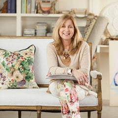
Kim Macumber is an interior designer with a diverse background that has shaped her design aesthetic. A previous career in hotels and resorts exposed her to luxury properties around the world, and sparked a passion for interior design, and she founded Kim Macumber Interiors in 2004. Kim's work has been featured in publications like The Boston Globe, New England Fine Living, Arts and Antiques of the South. You can also find Kim on Instagram.
Color = Happiness in my world! I truly believe that there are no colors that don’t “go” together. Look at nature, it is bursting with every color. What does matter is scale and where it is used. There are rooms where I have used every color in the rainbow and it is fabulous! If you are looking to introduce more color into your home, my favorite inspiration is fabric. Find a pattern that you love and extract all the colors you can from it. It will be magical!
Wow! After being unsure of the response I'd get, I was amazed by the quality, thoughtfulness, and downright creativity of the insights I received from the experts I reached out to. And as someone who knows a bit about interior design, I've come away with lots of fresh ideas to apply to my next project.
And if once you've found the colors that speak to you most, the fun begins. Apart from paint you'll find some great ways to incorporate these colors into your home are items like area rugs, wall murals and throw cushions.
What about you?
Which one of these is your favorite approach? Or do you have something that already works for you? I'd love to hear from you - share your comments below.

